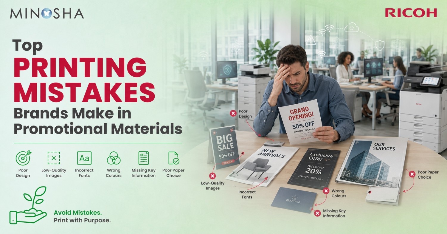
Top Printing Mistakes Brands Make in Promotional Materials
Promotional materials can make or break your marketing campaign. You spend hours perfecting your message and designing eye-catching graphics, only to watch your efforts fall flat when the printed pieces arrive. Common printing mistakes waste money, damage brand reputation, and miss opportunities to connect with potential customers. These errors happen more often than you’d think, even to experienced marketing teams.
The good news? Most printing mistakes are completely preventable. Understanding what goes wrong helps you avoid costly reprints and disappointing results. From file preparation issues to poor material choices, each mistake offers a learning opportunity. This guide reveals the most common printing errors brands make and shows you exactly how to avoid them in your next promotional campaign.
Ignoring Color Mode Requirements
RGB colors look gorgeous on your computer screen but translate terribly to print. Your monitor uses light to create colors, while printers use ink or toner on paper. That vibrant blue in your design file might print as dull purple. The bright red could turn muddy brown. Designers who skip converting files from RGB to CMYK mode set themselves up for disappointing results and expensive reprints.
Professional printing requires CMYK color mode because that’s how commercial production printers actually work. C stands for cyan, M for magenta, Y for yellow, and K for black. These four ink colors combine to create the full spectrum you see in printed materials. Always convert your files before sending them to the printer. Ask for color proofs when accuracy matters most. Your brand colors deserve to look consistent across every piece you produce.
Forgetting About Bleed and Safe Zones
Bleed refers to the extra image area that extends beyond your final trim size. Printers need this buffer because cutting machines can’t achieve perfect precision every single time. Without proper bleed, you risk white edges appearing on your finished pieces. Background colors that should extend to the edge might show paper peeking through instead.
Safe zones protect your important content from getting accidentally trimmed off. Keep text, logos, and critical design elements at least a quarter inch inside the final trim line. Phone numbers cut in half look unprofessional. Cropped email addresses become useless. These margins might seem overly cautious, but they prevent disasters. Design templates from your printer usually include these guides already marked, making it easy to position everything correctly from the start.
Choosing the Wrong Paper Stock
Paper weight dramatically affects how recipients perceive your promotional materials. Flimsy paper suggests your brand cuts corners and doesn’t value quality. Business cards printed on thin stock bend and tear easily in wallets. Postcards on lightweight paper feel cheap and get overlooked in the mail pile.
Finish matters just as much as weight for creating the right impression. Glossy paper makes photos pop with vibrant colors and high contrast. Matte finishes reduce glare and work better for text-heavy pieces like newsletters. Uncoated stock feels more natural and absorbs ink differently than coated papers. Testing samples before committing to large print runs saves you from regret. What looks perfect on your screen might need a completely different paper than you imagined to achieve the effect you want in real life.
Using Low Resolution Images
Pixelated photos scream amateur hour louder than almost any other printing mistake. Images that look fine on websites fall apart at print resolution. Your screen displays only 72 dots per inch, but quality printing requires 300 dots per inch minimum. That difference means images need to contain much more data for print than for digital use.
Trying to upscale a small image file creates blurry, fuzzy results that no amount of editing can fix. The data simply isn’t there to create sharp detail. Always start with high-resolution images captured specifically for print use. Stock photos should be downloaded at their largest available size. Taking a screenshot of an image and trying to print it guarantees disaster. Professional results demand professional-quality source files from the very beginning.
Overlooking Proofreading and File Checks
Typos in printed materials cost thousands of dollars to fix because you can’t just update a file and refresh. That misspelled phone number gets noticed by every recipient. The wrong date on your event flyer means reprinting the entire batch. Transposed digits in your website address send people to dead links or competitor sites instead.
Multiple people should review final files before approving them for production. Read everything backward to catch spelling errors your brain automatically corrects when reading normally. Print a test copy and review it in physical form rather than just on screen. Check that all fonts are embedded and converting properly. Verify that images are linked correctly and displaying at full resolution. These boring tasks prevent expensive emergencies and preserve your professional reputation.
Common Printing Mistakes Explained in Detail
Understanding specific errors helps you avoid them completely. Here’s what goes wrong most often:
- Not Building Files to Correct Specifications: Every cut sheet production printer has specific requirements for file setup. Margins, color modes, and bleeds must match what the equipment needs. Sending files built for one type of printer to another causes problems. Always get specifications from your printer before starting design work.
- Forgetting to Convert Text to Outlines: Fonts sometimes don’t transfer correctly between computers and printers. Text converts to strange characters or disappears entirely. Converting text to outlines turns letters into shapes that always print exactly as designed. This step matters most for logos and headlines using special fonts.
- Printing Tiny Text That Becomes Unreadable: That elegant 6-point font looks sophisticated on screen but turns into an illegible blur when printed. Body text should be at least 10 points for comfortable reading. Fine print in light colors on dark backgrounds becomes especially problematic. Test your smallest text sizes by printing samples before finalizing designs.
- Using Too Many Fonts: Mixing four or five different typefaces makes designs look chaotic and unprofessional. Stick to two or three fonts maximum for cohesive promotional materials. Use font weights and sizes to create hierarchy rather than switching typefaces. Consistency strengthens brand recognition across all your printed pieces.
- Ignoring Print Bleed and Margin Requirements: Designs that extend to the edge need at least 3mm of bleed beyond the trim line. Critical elements should stay 5mm inside the trim line for safety. These small measurements prevent huge problems during cutting and finishing.
- Choosing Incompatible Color Combinations: Some color combinations that work digitally fail in print. Bright colors printed on dark backgrounds show texture and inconsistency. Very light tints of colors might not print at all or look splotchy. Test challenging color combinations before using them across large print runs.
- Overlooking Paper Grain Direction: Paper has a grain direction that affects how it folds and curls. Folding against the grain causes cracking and rough edges. Grain direction matters especially for brochures and booklets. Discuss paper orientation with your printer for pieces that require folding.
- Neglecting to Check Color Accuracy: What you see on your uncalibrated monitor differs from printed results. Different monitors show colors differently. Request color proofs for projects where brand colors must match exactly. This costs a bit more but prevents expensive mistakes on important materials.
- Saving Files in Wrong Formats: JPEGs work fine for photos but terrible for graphics with text and solid colors. PDFs preserve everything exactly as designed. Vector files scale perfectly without losing quality. Using the right file format ensures your design translates perfectly from screen to paper.
Skipping the Professional Proof Stage
Many brands rush straight to full production without ordering proof copies first. This gamble sometimes pays off but often results in expensive regrets. Proofs reveal how colors actually print, how paper texture affects appearance, and whether your design works in physical form. Seeing and touching a proof helps you catch issues impossible to spot on screen.
Digital proofs show you file accuracy but not real printing conditions. Press proofs use actual production paper and ink, giving you exact previews of final results. The extra time and money spent on proofing saves far more by preventing large-scale mistakes. Rush jobs that skip proofing often end up costing more when reprints become necessary. Smart brands build proofing into their timeline and budget from the start.
Choosing Quantity Over Quality
Ordering massive quantities to get bulk discounts backfires when materials look cheap or contain errors. Those 10,000 business cards with the wrong phone number become expensive recycling. Printing more than you’ll use within six months often wastes money because designs and information change. Quality materials in appropriate quantities outperform cheap printing every time.
Start with smaller test batches before committing to huge orders. Order enough promotional materials for three months instead of a full year. This approach lets you refine designs based on real-world feedback. Printing technology advances quickly, so those great deals on last year’s style might look dated soon. Materials gathering dust in storage represent wasted budget that could fund fresh, relevant campaigns.
Using Inconsistent Branding Across Materials
Your business cards show one logo version while brochures display another slightly different design. Colors that should match appear in varying shades across different pieces. Font choices change from one promotional item to the next. These inconsistencies confuse customers and weaken brand recognition instead of building it.
Create detailed brand guidelines that specify exact colors, fonts, and logo versions for all printed materials. Share these standards with everyone who creates promotional content. Using a Ricoh multifunction printer or other quality equipment helps maintain consistency, but proper file management matters more. Keep master files organized and clearly labeled. Update all materials simultaneously when brand standards change. Cohesive branding across every touchpoint makes your company look professional and established.
Neglecting Print Production Timelines
Designers often underestimate how long quality printing actually takes. Rush fees eat into budgets and still might not deliver materials when you need them. Printers need time to prepare files, create plates, run production, and apply finishing touches. Cutting corners on timeline results in poor quality or missed deadlines that damage your marketing efforts.
Build realistic timelines that include design, revisions, proofing, production, and delivery. Add buffer time for unexpected delays or necessary changes. Communicate deadlines clearly with your printing partner from the beginning. Starting projects earlier reduces stress and usually saves money by avoiding rush charges. Quality promotional materials take time to produce properly, and planning ahead ensures you get the results your brand deserves.
Failing to Consider Finishing Options
Basic printing without any finishing techniques makes promotional materials forgettable. Rounded corners on business cards cost pennies more but make huge impressions. Spot UV coating on logos creates eye-catching contrast against matte backgrounds. Folding options transform simple pages into engaging interactive pieces that people actually keep.
Research finishing options before finalizing your designs. Some effects require specific file preparation or design adjustments. Embossing and foil stamping need separate artwork layers. Die-cutting requires precise vector paths. Discussing finishing possibilities early lets you design specifically for those enhancements. The right finishing touches elevate ordinary prints into premium promotional materials that reflect well on your brand.
Not Testing Different Formats and Sizes
Every brand defaults to standard business card sizes and letter-sized flyers. Standing out requires thinking beyond conventional dimensions. Oversized postcards get noticed in mail stacks. Square brochures look distinctive on display racks. Odd-shaped die-cut pieces make people stop and look instead of immediately recycling.
Consider how recipients will encounter and use your promotional materials. Cards that fit standard wallet slots get kept instead of discarded. Brochures sized for standard literature holders actually get displayed. Door hangers need specific dimensions to work properly. Test unusual formats on small print runs before investing in large quantities. Creative sizing grabs attention, but practical sizing ensures your materials get used as intended.
Trusting Automatic Color Correction
Printer software often applies automatic color adjustments that alter your carefully chosen brand colors. These “helpful” corrections assume you don’t know what you’re doing. Your branded blue shifts toward cyan. Your specific orange turns generic. Automatic settings optimize for generic photos rather than preserving your exact color specifications.
Disable all automatic color correction features and provide properly prepared CMYK files instead. Include Pantone color specifications for brand-critical elements when using offset printing. Communicate color expectations clearly with your print provider. Request they match your physical brand standards or previous print samples. Taking control of color management prevents surprises and maintains consistency across all your promotional materials.
Conclusion: Learning from Mistakes Creates Better Results
Every printing mistake teaches valuable lessons that improve your future promotional materials. Most errors stem from rushing, skipping communication with printers, or trying to cut corners that shouldn’t be cut. Investing time in proper file preparation, proofing, and quality materials pays dividends through professional results that enhance your brand.
Start preventing these mistakes on your very next print project. Create checklists that cover file preparation, proofing requirements, and timeline planning. Build relationships with reliable print providers who guide you toward success rather than just taking orders. Your promotional materials represent your brand in physical form, making them too important to leave to chance. Learn from others’ mistakes instead of making them yourself, and watch your printed marketing materials deliver the results your campaigns deserve.