Have you ever printed a beautiful photo only to find the colors look nothing like what you saw on your screen? Or maybe you’ve designed something for work that looked perfect on your computer but came out all wrong when printed. This frustrating experience happens to almost everyone at some point, and there’s a good reason for it: RGB and CMYK are two different color worlds that don’t always translate well between each other.
Your computer screen shows colors using light (RGB), but printers create colors using ink (CMYK). This fundamental difference is why what you see isn’t always what you get.
Think about it like this: your screen is like a flashlight in a dark room – it adds light to create colors. Your printer is more like painting on white paper – it adds ink that blocks some light to create colors.
RGB stands for Red, Green, and Blue. These are the primary colors of light. When you mix these colored lights together:
Your computer monitor, phone, and TV all use RGB. They create every color you see by mixing different amounts of red, green, and blue light. This system can create millions of vibrant colors, especially bright blues, electric greens, and glowing reds that seem to pop off the screen.
The RGB color range (called a “gamut”) includes many bright, vivid colors that simply cannot be created with ink.
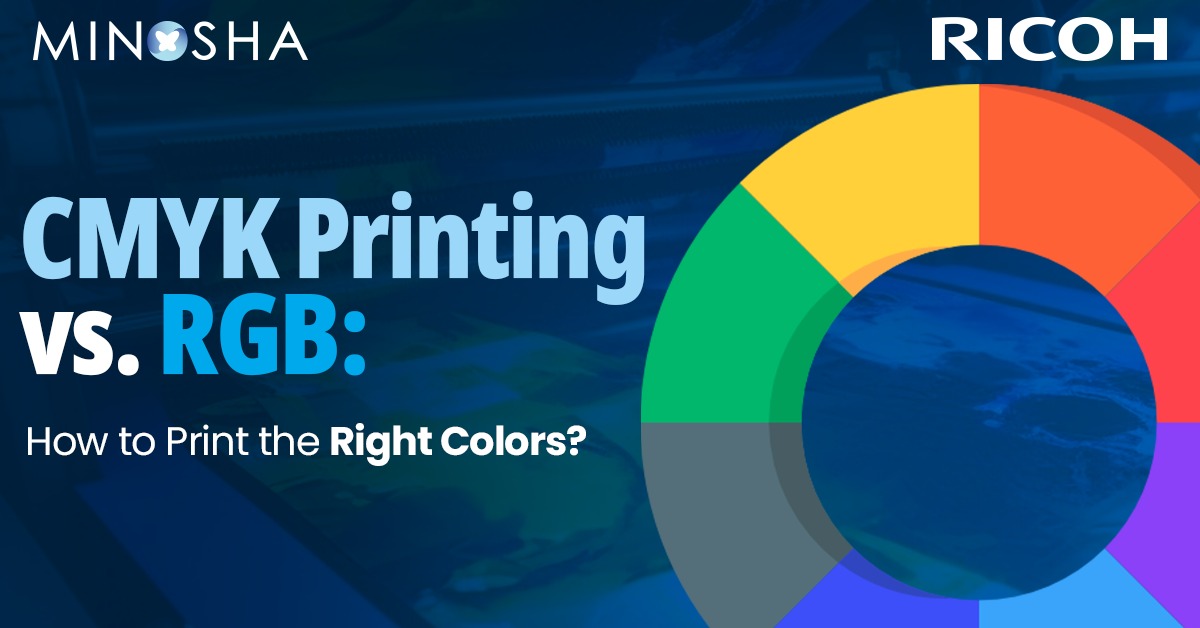
CMYK stands for Cyan, Magenta, Yellow, and Key (black). These are the standard ink colors used by most Color Production Printers.
With CMYK printing:
CMYK works by subtracting light. Each ink absorbs (or subtracts) certain wavelengths of light and reflects others. The colors you see are the light wavelengths that aren’t absorbed by the ink.
The biggest problem is that RGB can create colors that CMYK simply cannot match. This is especially true for:
When you design something in RGB and then print it using a production printer, these “out-of-gamut” colors get converted to the closest possible CMYK equivalent – which often means they become duller, darker, or slightly shifted in tone.
Getting your printed materials to match what you see on screen can be challenging, but there are several steps you can take to improve your results:
If you’re creating something that will be printed, set your design software to CMYK color mode right from the beginning. Programs like Adobe Photoshop, Illustrator, and InDesign allow you to choose your color mode.
When you work in CMYK mode, what you see on screen will be a closer approximation of what will print. Your software will limit your color choices to ones that can actually be reproduced with ink.
Recommended Read – Interactive Panel Trends Shaping the Future of the Printing Industry
Color profiles are like translation dictionaries between different devices. They help maintain consistent colors across different screens and printers.
Most professional design software allows you to set color profiles. Look for options like:
These profiles help predict how colors will appear when printed on different types of paper using standard printing processes.
The paper you print on dramatically affects how colors appear:
For professional printing jobs, always ask for a proof before the full print run. A proof is a test print that lets you see how the final product will look. There are different types:
A poorly calibrated monitor can make even perfect CMYK workflows fail. Consider:
Recommended Read – Smart Workspaces Start Here: RICOH Interactive Whiteboards A6510, A7510, and A8610 for Seamless Productivity
For absolute color consistency, especially for brand colors, consider using spot colors like Pantone. These are pre-mixed inks that print exactly the same every time, unlike colors created by mixing CMYK inks.
If your vibrant design looks flat and dull when printed, you were probably working in RGB with colors that are outside the CMYK range.
Solution: Switch to CMYK mode early in your design process so you can adjust your color choices accordingly. Consider increasing contrast and saturation slightly to compensate for what will be lost in printing.
If your prints consistently come out darker than expected:
Solution:
Certain colors are particularly prone to shifting when converted from RGB to CMYK.
Solution:
Digital printing technologies (like those used in office printers and many quick-print shops) typically have a smaller color range than offset printing. This means:
Digital printing is great for small runs and quick turnarounds, but be prepared for slightly less impressive color reproduction.
Traditional offset printing generally offers better color reproduction but requires larger print runs to be cost-effective. Benefits include:
Photos often contain colors that are outside the CMYK gamut. To prepare photos for printing:
Consistency is key for branding. Consider:
Artists often use pigments that cannot be perfectly reproduced in CMYK. When printing art:
Traditional four-color CMYK printing is gradually being supplemented by expanded gamut printing, which adds extra colors (often orange, green, and violet) to the standard CMYK inks. This approach can reproduce a much wider range of colors, getting closer to what we see on screens.
Some printing systems now use six or seven colors to create prints that more closely match what we see in RGB. While not yet standard for everyday printing, this technology is becoming more accessible and may eventually help bridge the gap between screen and print.
When working with a professional print shop:
Good printers have experience with color management and can help you achieve the best possible results.
Understanding the difference between RGB and CMYK isn’t just technical knowledge—it’s essential for anyone who wants their printed materials to look as intended. The key is to set realistic expectations and plan for the conversion from screen to paper.
Remember that some vibrant RGB colors simply cannot be reproduced in CMYK, no matter how good your printer is. Instead of fighting this limitation, embrace it by designing with printable colors from the start.
With practice, you’ll develop an eye for which colors will translate well to print and which won’t. You’ll learn to compensate for the differences and create designs that look great both on screen and on paper.
The RGB/CMYK disconnect has frustrated designers, photographers, and everyday users for decades. By understanding the fundamentals of how each system works, you can avoid disappointment and produce printed materials that look as close as possible to what you envisioned on your screen.


Subscribe to our Newsletter for Exclusive Insights and Updates!
